Logos are important for building brand awareness for all companies. Just think of McDonald’s golden arches or Wendy’s red hair and pigtails. Logos help consumers identify their favorite restaurants, sports teams and clothing. But logos are especially valuable to the airline industry because they appear everywhere throughout the places where airlines do business.
Commercial airlines display their logos on the side of every plane in their fleet. These logos are found dotted along the concourses of airports and are found in lit up displays behind ticket counters. Any given airline’s brand awareness basically revolves around its logo. So, whatever happened to United’s beloved Tulip?
United’s Tulip logo is so popular, it even has its own Facebook fan page.
Seriously? I don’t even have that many likes on my Facebook page (but I’m working on it).
To understand the importance of the Tulip to some people, one must trace the history of United Airlines back to its merger with Continental. And to be fair, ex-Continental employees may not be as fond of the retro logo as those who started their careers with United. Still, it is interesting to examine the history. Let’s take a trip down memory lane.
History of the UAL Tulip
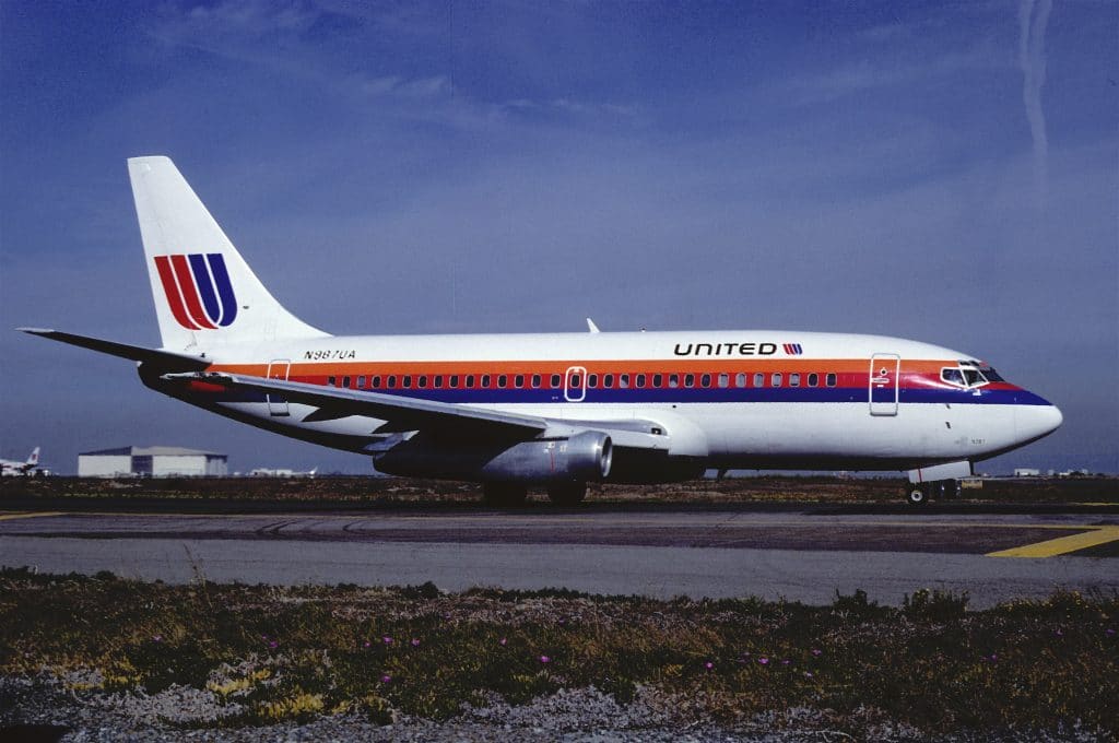
Around 1973, designer Saul Bass developed the logo. It was to remain in place almost 20 years until 1993. The colorful striped logo with the overlapping letter U was in use until the merger with Continental and had only a few modifications.
Saul Bass’ rainbow livery was the first and featured a white fuselage with red, orange and blue stripes along the cheatline. Despite a slight change in 1988 that moved the stripes further down so the United font could be enlarged, the logo remained the same. The marketing push included the phrase, “Fly the Friendly Skies” and United acquired the rights to use the Gershwin song, “Rhapsody in Blue.”

The United Tulip Goes Grey
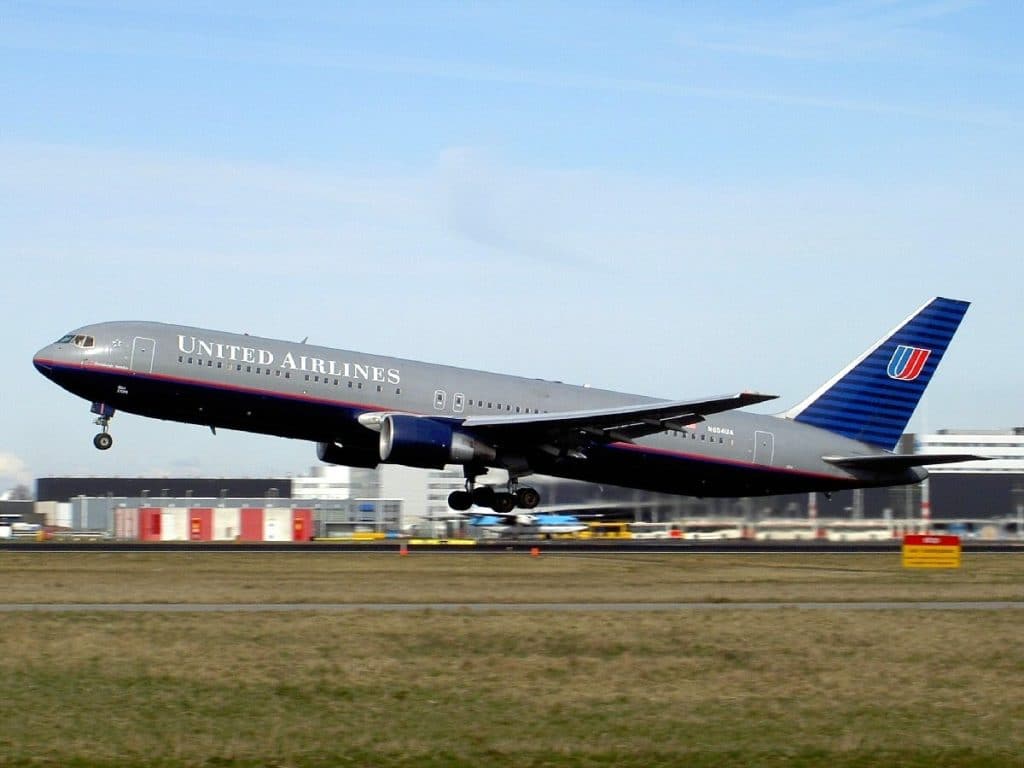
In 1993, Stephen Wolf, United’s Chief Executive Officer, revised the branding to a dark blue and grey fuselage with blue stripes on the tail. The Tulip was shrunk down in size but remained. This was called the “Battleship” livery and was supposed to portray a more professional, global image.

The logo went through another revision in 1997, when United commissioned Pentagram for an update. The Tulip was kept but United’s name got a new font that appeared in advertising but not on the actual aircraft.
Refresh for the United Tulip
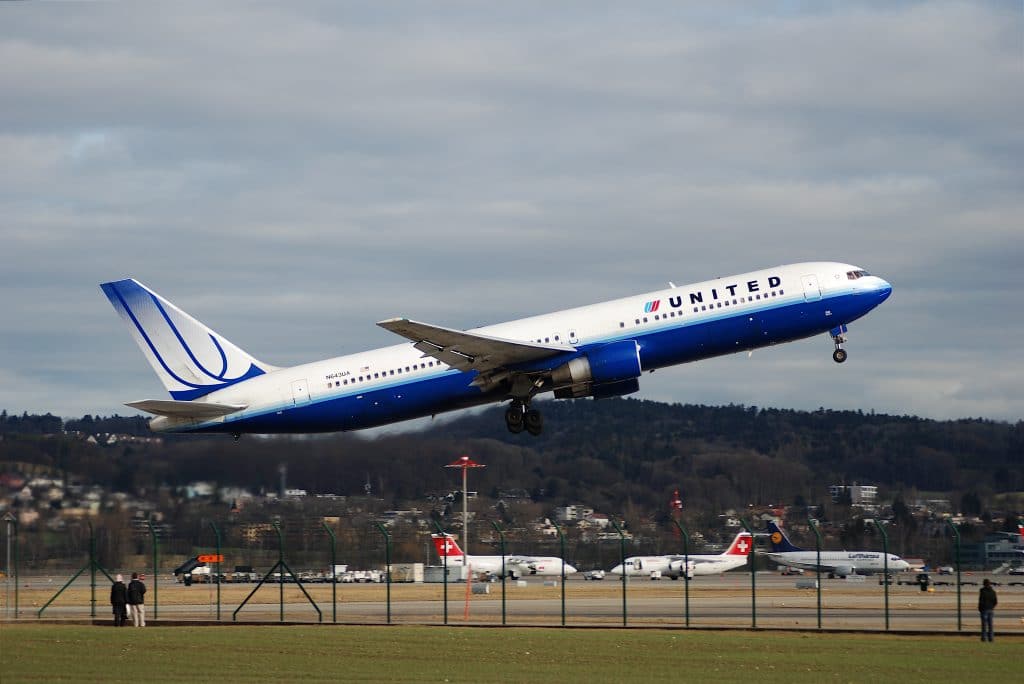
The next change came in February 2004 when the Blue Tulip livery design was introduced to symbolize United’s emergence from bankruptcy. The aircraft tail displayed a bigger version of the Tulip, albeit cropped and now with a blue tint.

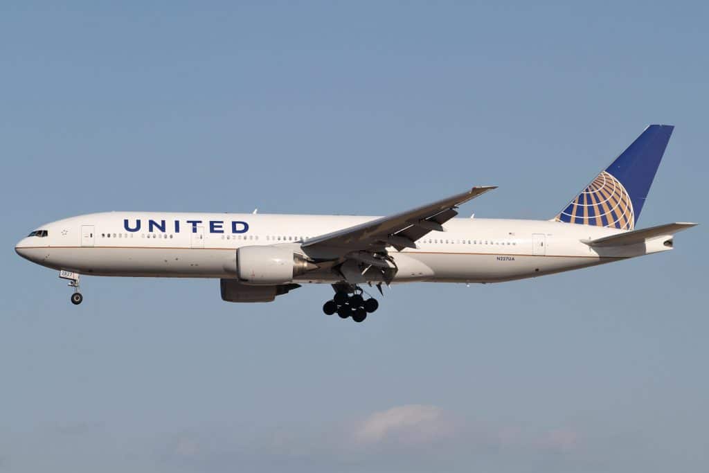
After United’s merger with Continental in 2010, the newly formed airline disposed of the Tulip and instead, used Continental’s ‘Globe’ logo design. The then-head of the new airlines marketing department Mark Bergsrud said the Globe logo reflected worldwide reach and was more likely to attract corporate clients. To some Tulip fans’ dismay, at the time Bergsrud commented, “Do we want to stand out? Absolutely. But spiffy liveries just have to fall to a lower level of priority.” Ouch.

United’s Current Livery Came From A Boardroom
That’s when the “Save the United Airlines Tulip” Facebook page was originally launched. Employees, passengers and marketing experts all added their voices to the concern, saying the Tulip had better brand recognition.
CEO Jeff Smisek got ‘mud on his face’ when he admitted that he and United’s previous CEO, Glenn Tilton, came up with the new livery and brand by themselves, with no outside help from the marketing department. Tsk tsk.
Today, the Tulip’s popularity extends beyond social media to the retail world. Buy your Tulip-loving friend or family member a hoody with the United ’98-’10 large Tulip emblazoned on the front. The logo may not be on the side of United’s airplanes but it lives on in fashion. EBay even has Save the Tulip Logo t-shirts.
One could argue that the current livery is sending a mixed branding message since it displays United’s name but has Continental’s Globe logo. Others claim that most passengers could care less what logo an airline uses. All most passengers care about is the airline’s performance. But maybe it’s not that farfetched that the Tulip is linked to a higher level of service.
United’s current globe livery does invoke memories of merger-induced meltdowns and poor customer service. Many United employees still pine for the Tulip logo design to return.

Those who were dismayed ab the tulips disappearance back in 2010 are only saying that because of their own nostalgia and resistance to change and don’t realize how life really works as how change is inevitable whether we like it or not. The tulip had been around since 1974 so it was 36 years by 2010. That’s a long time for an emblem and they decided it was time for s change to prepare for the next generation and to look into the long term future. I understand it’s tough to let things go but at the same time the comments I see from people are baffling to me like come on people it’s such a waste of time to fight for something that isn’t worth it, as I said things can’t stay the way you want them forever since everything comes and goes as time goes on. What happened made perfect sense because United was a more popular airline while the continental identity was a newer and more modern identity with a bigger meaning to it. The goal of this combination was to create a perfect 50/50 combo of these companies and the way it occurred made a lot of sense. United had a mission to make themselves as a global airline and to unite the world and the earth we live on is a globe so it all adds up perfectly. Personal preferences and opinions can never be stronger than reality and how life truly works. Whether we like it or not, everything goes through changes and while the past shall never be erased, it’s important to process changes while you can then embrace them rather than take it for granted and regret it later. The tulip had a great run in the previous era but in 2010 it simply aged out and it’s gone forever but it’ll always be a part of history!