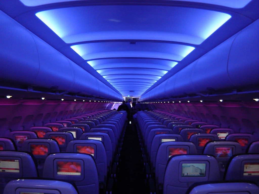
Virgin America went to considerable lengths to put together their new logo.
One description of consuming Internet offerings is drinking from a fire hose. There’s just so much and it’s moving so fast. Add in a specific date of the year that is known for tomfoolery plus one company trying to spoof another and you’ve got … this story.
Virgin America’s New Logo Looks Suspicious
Virgin America – which has been in the news recently because it might (or might not) be for sale – announced that it had designed a new logo for the company.
As is the custom nowadays, the story was accompanied by a video that explained how and why the logo came to life. You can watch the video below and the “new” logo is displayed above.
Anyone with an imagination can watch the video and look at the logo and figure out the logo is a spoof. The design is meant to evoke the image of female breasts. (Although you can also imagine the image looks like two raindrops.)
Keep in mind that changing logos for a company is an expensive proposition. Not only does the company lose the recognition factor of the old brand, implementing the new brand costs a lot of money. With an airline, new paint jobs for your fleet is a considerably pricey proposition.
April Fools!
So, while a number of folks fell for the gag, it’s just that. Check the calendar. April Fools, folks.
Virginia America and its boss Richard Branson also appeared to be throwing some shade at Airbnb. It revealed its logo – its real log – in 2014 and called it the “Bélo.” The name and the image was supposed to convey a sense of “belonging.”
When it was revealed two years ago, social media wasn’t very social. The comments were in the gutter, suggesting that the Airbnb logo looked like genitalia – male or female, take your pick.
(And if you’re on the sidewalk and not in the gutter, it’s not a reach to say the Airbnb logo looks like a paper clip.)

